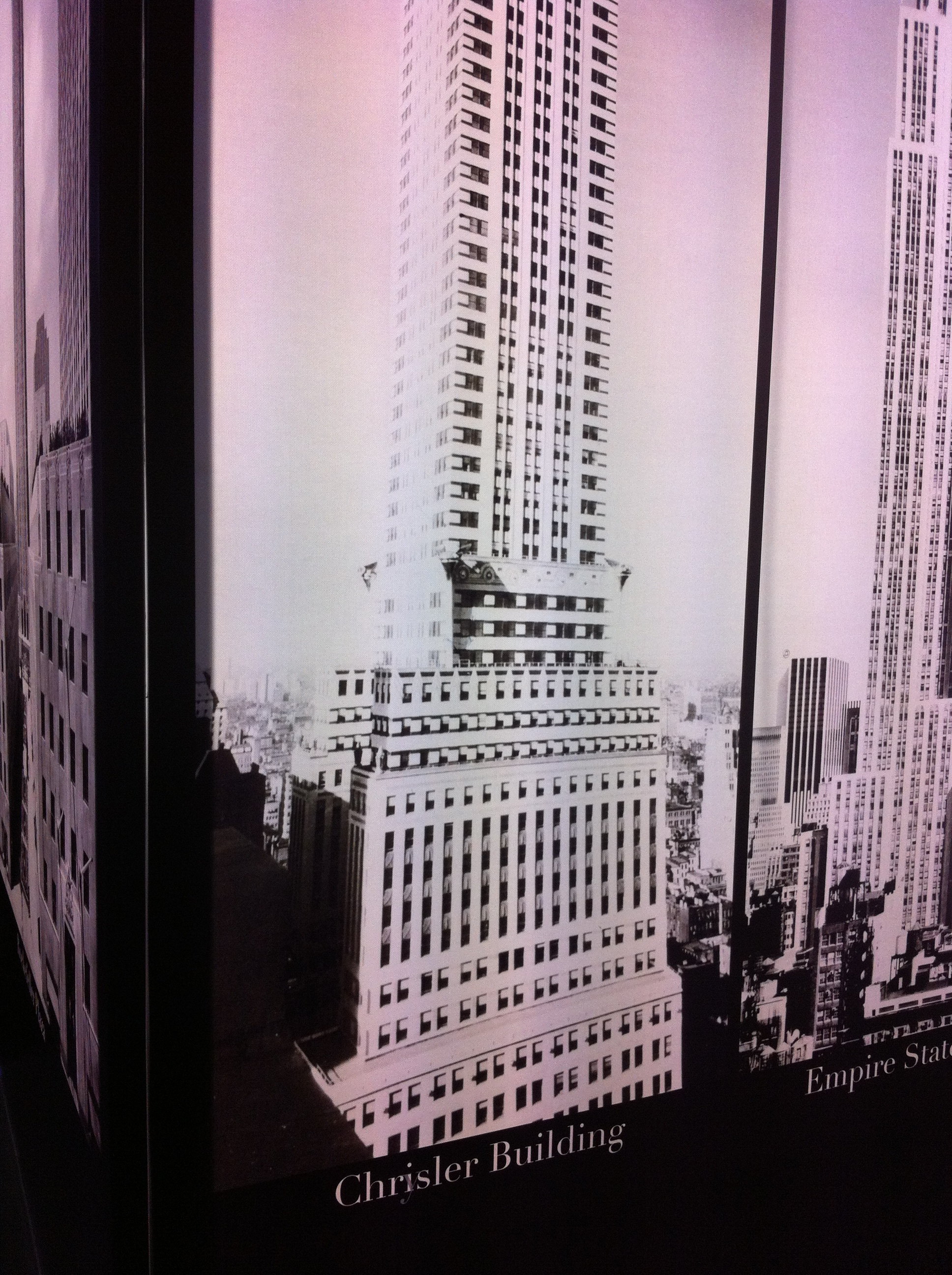
It doesn't work. It just makes you look like a donkey's rear end. And about as intelligent as its front end. Example 1:
That, ladies and gentlemen, is a picture of the Chrysler Building, labeled "Chrisler Building."
It was found in an exhibit called "New York, New York!" at a big expo just outside of Lyon, France. A French person's take on New York City, if you will. So of course, it opened with a scale model of the Statue of Liberty's torch -- gotta highlight the ties between the two great nations! Then it continued on to the jazz era, stock market crash, taxicabs, etc. Including a large swath of skyscrapers.
But what's even more adorable about this hilarious typo is that they actually tried to fix it after the fact. If you look closely, you'll see a faint overlay of a slightly translucent "y" over the much clearer "i" in the picture.
And as if that wasn't enough, there was an even bigger problem. In the same lineup of iconic New York City skyscrapers, we saw, proudly displayed, a picture of the Tribune Tower.
In Chicago.
I'm sure they meant the Tribune Building. But by then, I had lost all hope. Gave up. Too depressed to take a picture. Even though it was a hilarious picture, with the first part of the "Chicago Tribune" logo on the building next door still visible.
So what, though? Most French people won't know the difference. And it's not going to have any sort of detrimental effect on their daily lives.
But it's still wrong. And there will be people who notice. Probably a couple of important people. Maybe even clients. Or potential clients. If I had any relevant power, I'd be firing (or not ever hiring) the people who created that exhibit.
In conclusion, please be careful. Like I was, reading over this post four times before sending it off into the ether.

